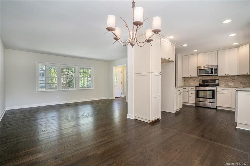
An interior color scheme is not a paint color. It’s a system. It’s the relationship between your wall color, trim, ceiling, floors, and accent colors working together across multiple rooms and levels simultaneously — which is exactly what makes choosing one for a split-level so uniquely challenging.
In a ranch or colonial, you can pick a color room by room because each room is relatively contained. In a split-level, you can often see three different spaces from one standing position. The entry bleeds into the living room. The living room opens to the dining area. The staircase connects every level visually. A color decision in one space affects how every connected space looks and feels.
This guide gives you eight complete interior color schemes designed specifically for split-level architecture — not just individual colors, but full systems with wall colors, trim, ceilings, and accent recommendations for every level of the home.
The Split-Level Interior Color Rules
Before the schemes, three rules that apply to every split-level interior regardless of style:
Rule 1: One primary color throughout the main living floor. The entry, living room, dining area, and kitchen visible on the main level should share one wall color. If your kitchen is still in it’s original state, my kitchen remodel page covers everything you need to know.
Color changes between these spaces create visual stops that make the home feel smaller and more fragmented. Save the color variation for the upper bedroom level and lower level — spaces separated by a full stair run.
Rule 2: Consistent trim color throughout the entire home. The trim travels through every level and ties the whole interior together. Changing trim colors between levels is one of the most common split-level decorating mistakes. Pick one trim white and use it everywhere.
Rule 3: Your ceiling color matters more in a split-level than any other home. Low ceilings are the defining challenge of split-level interiors. The right ceiling treatment — color, sheen, and edge treatment — either minimizes that challenge or amplifies it. We’ll cover this for each scheme.
Lighting is the other half of the equation, see our lighting guide for seven upgrades that make low cielings feel intentional rather than limiting.
You'll probably also like our choices for exterior color schemes.
8 Complete Interior Color Schemes for Split-Level Homes
Scheme 1 — The Modern Neutral: Warm Gray Throughout
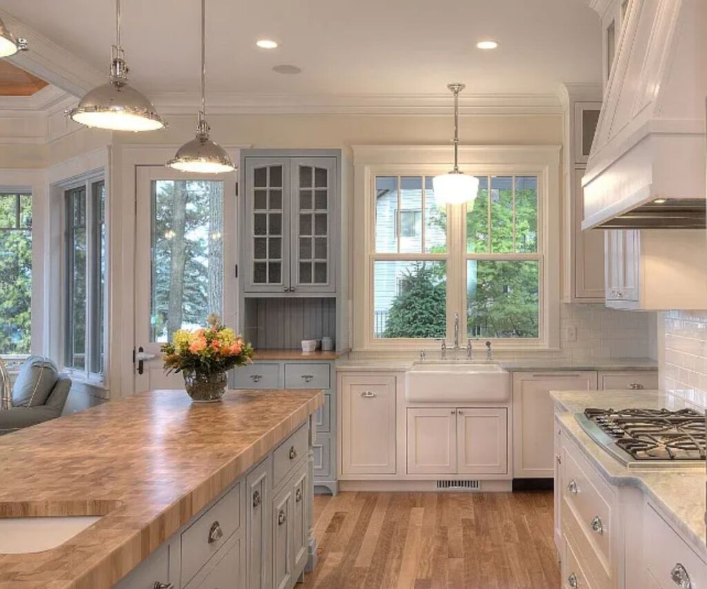
This is the most universally applicable scheme for split-levels and the starting point I recommend to anyone who isn’t sure where to begin. A warm gray on all main living surfaces — entry, living room, dining, kitchen — creates cohesion and calm without feeling cold or clinical.
The Full Palette:
- Main level walls: Agreeable Gray — Sherwin-Williams SW 7029
- Upper bedroom walls: Repose Gray — Sherwin-Williams SW 7015 (slightly cooler variation)
- Lower level walls: Accessible Beige — Sherwin-Williams SW 7036 (warmer to compensate for less light)
- Trim throughout: Extra White — Sherwin-Williams SW 7006
- Ceiling throughout: Ceiling Bright White — flat finish
- Accent color: Navy, charcoal, or deep green in pillows, rugs, and artwork
Why it works in a split-level: Agreeable Gray has an LRV of 60 — high enough to open up dark split-level spaces while warm enough not to feel stark. The slight variation between levels (cooler upstairs, warmer downstairs) gives each level its own personality while keeping the overall palette cohesive.
Best flooring match: Medium-toned LVP or hardwood in warm honey or walnut tones. Cool gray flooring competes with warm gray walls.
Scheme 2 — The Bright Modern: White and Black
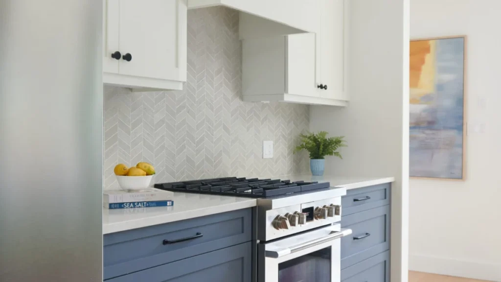
For split-levels that have been modernized — new LVP flooring, updated staircase, open floor plan — a white and black interior scheme is the most contemporary and visually striking option available. White walls, black accents, warm wood tones. It’s the interior equivalent of the black exterior scheme and it photographs like a design magazine spread.
The Full Palette:
- Main level walls: White Dove — Benjamin Moore OC-17
- Upper bedroom walls: White Dove continued or Chantilly Lace OC-65 for a brighter option
- Lower level walls: Accessible Beige or a deliberate dark — Naval SW 6244 as a feature wall
- Trim throughout: Chantilly Lace — Benjamin Moore OC-65 (brighter than White Dove for contrast)
- Ceiling throughout: Ceiling Bright White — flat finish
- Accent color: Matte black in fixtures, hardware, light switches, and accessories
- Warm element: Natural wood tones in furniture and flooring to prevent the scheme from feeling cold
Why it works in a split-level: White walls maximize light reflectance, which is critical in a home type prone to dark interiors. The black accents provide definition without the visual weight of a dark wall color. The warm wood element prevents the scheme from feeling sterile.
Important caveat: This scheme requires the renovation work to already be done. White walls on unrenovated surfaces with original oak trim and dated finishes will highlight everything you haven’t updated yet. Save this for after the floors, staircase, and fixtures are modernized.
Scheme 3 — The Warm Classic: Beige and Cream
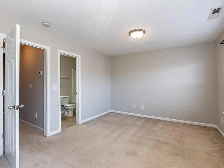
For split-levels with original warm hardwood floors, traditional millwork, and a more classic aesthetic, a beige and cream palette works with the existing finishes rather than against them. This is the scheme that makes a gently updated split-level feel timeless and well-appointed rather than simply “not renovated yet.”
The Full Palette:
- Main level walls: Accessible Beige — Sherwin-Williams SW 7036
- Upper bedroom walls: Antique White — Sherwin-Williams SW 6119
- Lower level walls: Creamy — Sherwin-Williams SW 7012 (lighter to compensate for below-grade darkness)
- Trim throughout: Creamy — Sherwin-Williams SW 7012
- Ceiling throughout: Ceiling Bright White — flat finish
- Accent color: Deep burgundy, hunter green, or navy in soft furnishings
Why it works in a split-level: Warm beige coordinates naturally with honey oak and warm hardwood floors that are expensive to replace. It reads as clean and updated without requiring new floors, new trim, or new millwork. The cream trim softens the contrast between wall and trim for a cohesive traditional look.
Scheme 4 — The Moody Lower Level: Light Above, Dark Below
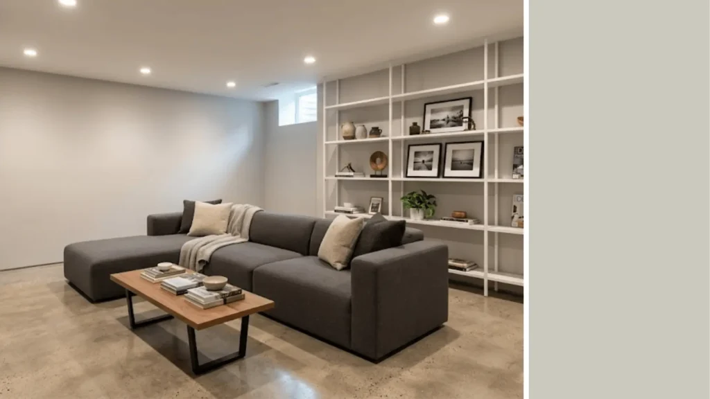
This scheme embraces the split-level’s natural light variation rather than fighting it. The upper levels get light, airy neutrals that maximize brightness. The lower level — which has less natural light anyway — gets a deliberately dark, moody color that makes the below-grade feel cozy and intentional rather than dim and depressing.
The Full Palette:
- Main level walls: Repose Gray — Sherwin-Williams SW 7015
- Upper bedroom walls: Repose Gray continued or Comfort Gray SW 6205
- Lower level walls: Naval — Sherwin-Williams SW 6244 (all four walls or feature wall)
- Lower level ceiling: Naval continued (yes, the ceiling too — it completes the cocoon effect)
- Trim throughout: Extra White — Sherwin-Williams SW 7006
- Lower level accent: Brass or warm gold fixtures and accessories against the navy
Why it works in a split-level: This is the scheme that gets the most dramatic before-and-after reaction. The lower level — often the most problematic space in a split-level — becomes the most coveted room in the house. Dark walls and ceiling in a below-grade space eliminate the “basement” feel entirely and replace it with something that feels like a deliberate design choice.
If your lower level is still unfinished, framing ductwork and HVAC comes before paint.
Scheme 5 — The Nature-Inspired: Sage and Warm White
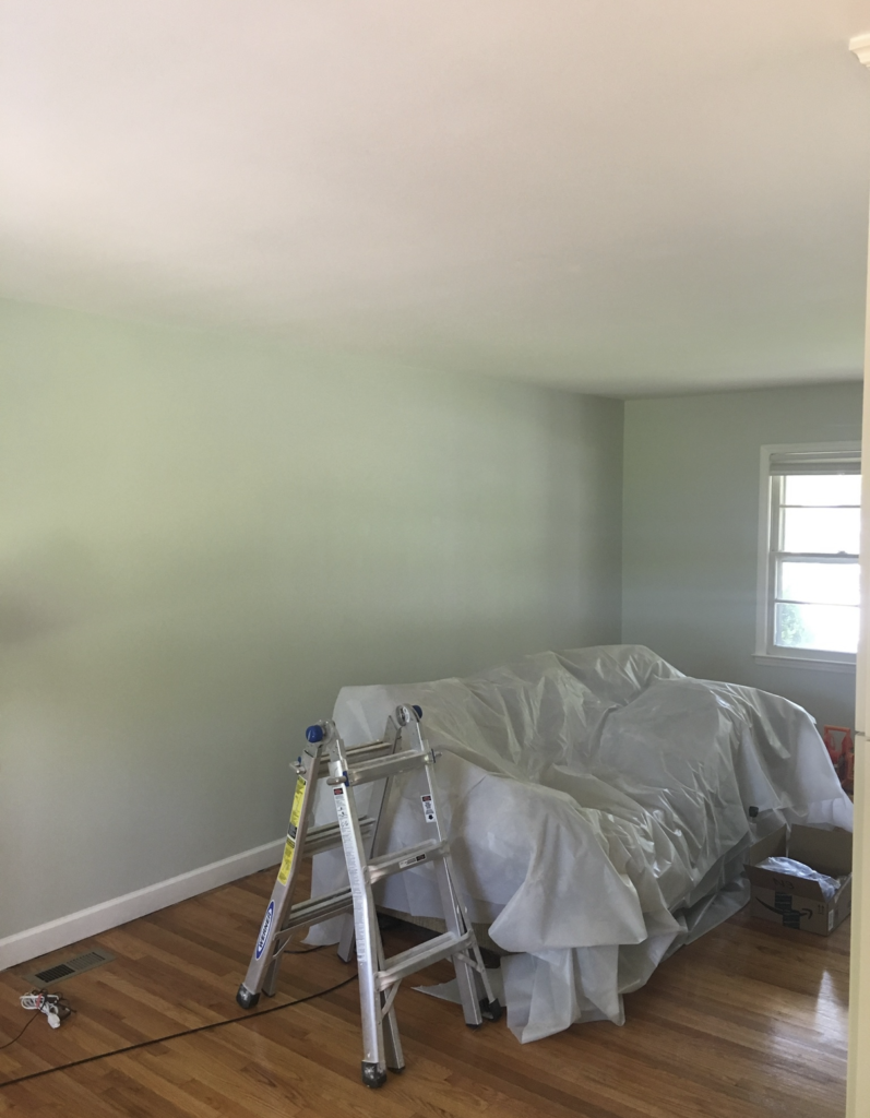
Sage green has been the dominant interior color trend for several years and it works exceptionally well in split-levels because it’s warm enough to counteract the lack of natural light without being as heavy as a gray. Sage reads as organic, calming, and sophisticated — and it coordinates beautifully with the natural wood tones common in mid-century split-levels.
The Full Palette:
- Main level walls: Comfort Gray — Sherwin-Williams SW 6205
- Upper bedroom walls: Rainwashed — Sherwin-Williams SW 6211 (softer, more blue-green variation)
- Lower level walls: Accessible Beige or Creamy — the warmth balances the cooler green upstairs
- Trim throughout: Extra White — Sherwin-Williams SW 7006
- Ceiling throughout: Ceiling Bright White — flat finish
- Accent color: Warm terracotta, natural linen, and wood tones
Why it works in a split-level: If you haven’t noticed, this shit is actually green. I painted the main level of my split-level home this color and it worked out great. The organic quality of sage green coordinates naturally with the mid-century architecture of most split-levels. It doesn’t fight the bones of the home the way stark contemporary colors sometimes do. And the warm terracotta and linen accents give the palette a warmth that prevents the green from feeling cold.
Scheme 6 — The Dramatic Contrast: Charcoal Accents and Soft Walls
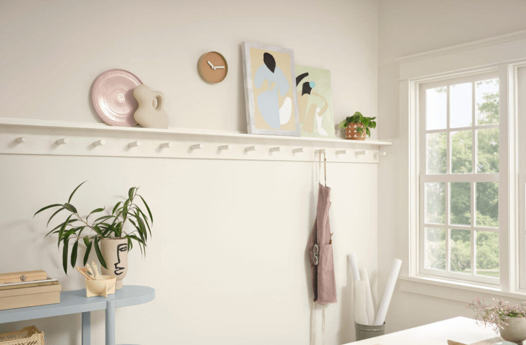
This scheme uses a soft, light wall color as a canvas for bold charcoal or near-black accents — a fireplace surround, a built-in bookcase, a kitchen island, an accent wall behind the staircase. In a split-level, the staircase wall is the perfect location for a dramatic dark accent because it’s visible from multiple levels simultaneously and makes an immediate design statement.
The Full Palette:
- Main level walls: Alabaster — Sherwin-Williams SW 7008
- Accent walls / feature elements: Urbane Bronze — Sherwin-Williams SW 7048
- Upper bedroom walls: Alabaster continued
- Lower level walls: Urbane Bronze as a full room color
- Trim throughout: Extra White — Sherwin-Williams SW 7006
- Ceiling throughout: Ceiling Bright White — flat finish
- Accent color: Warm brass, natural leather, and aged wood tones
Why it works in a split-level: Urbane Bronze (Sherwin-Williams 2021 Color of the Year) is a warm, brown-toned charcoal that reads as sophisticated rather than cold. Against soft Alabaster walls, it creates a contrast that feels curated and intentional. Used on the staircase wall — the visual spine of a split-level — it creates a focal point that anchors the entire interior.
Scheme 7 — The Earthy Warm: Terracotta and Cream
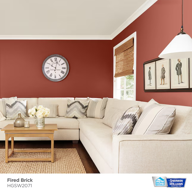
For the split-level owner who wants warmth, personality, and a departure from the gray-and-white palette that dominates renovation content, terracotta and warm earth tones offer something genuinely distinctive. This palette is influenced by southwestern and Mediterranean design but translates beautifully into mid-century split-level architecture.
The Full Palette:
- Main level walls: Antique White — Sherwin-Williams SW 6119 (warm base for the whole main level)
- Accent wall (fireplace, dining): Fired Brick — Sherwin-Williams SW 6317 or similar terracotta
- Upper bedroom walls: Antique White or a soft blush
- Lower level walls: Creamy — Sherwin-Williams SW 7012
- Trim throughout: Creamy — SW 7012 (same as walls for a softer transition)
- Ceiling throughout: Ceiling Bright White — flat finish
- Accent color: Deep turquoise, sage green, natural jute, and woven textures
Why it works in a split-level: The warm cream base keeps the main level cohesive across all the spaces visible simultaneously. The terracotta accent is used only on contained feature walls where it doesn’t interrupt the visual flow between spaces. The result is a home that feels warm, personal, and distinctly non-generic.
Scheme 8 — The Budget Transformation: One Color, Whole House
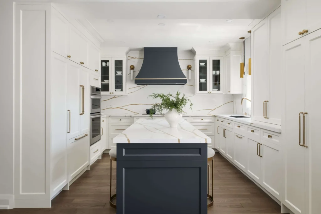
This is for the homeowner who wants maximum impact at minimum cost and decision fatigue. One color. Every room. Every level. Same wall color, same trim color, top to bottom. It sounds boring in theory. In practice, on a split-level, it’s one of the most effective transformations possible.
The Full Palette:
- All walls, all levels: Agreeable Gray — Sherwin-Williams SW 7029
- All trim, all levels: Extra White — Sherwin-Williams SW 7006
- All ceilings: Ceiling Bright White — flat finish
- Accent color: Introduced entirely through furniture, rugs, and accessories — no paint commitment
Why it works in a split-level: The visual continuity of one color throughout all levels eliminates every awkward color transition and makes the home feel significantly larger and more cohesive. The architecture does the visual work — the color just gets out of the way. For a first-time split-level paint project, this scheme delivers the best results with the least risk.
Cost advantage: Buying one color in bulk (two 5-gallon buckets) is cheaper than buying multiple colors in smaller quantities. One color also means no leftover mismatched gallons sitting in the garage.

Giveaways, Ebook, and Forum coming soon. Be the first to know about new content!
Interior Color Scheme Quick Reference
| Scheme | Main Level | Lower Level | Trim | Best For |
|---|---|---|---|---|
| Modern Neutral | Agreeable Gray | Accessible Beige | Extra White | Any split-level, safest choice |
| Bright Modern | White Dove | Naval accent | Chantilly Lace | Modernized interiors |
| Warm Classic | Accessible Beige | Creamy | Creamy | Original hardwood floors |
| Moody Lower Level | Repose Gray | Naval (all walls) | Extra White | Dark lower level problem |
| Nature-Inspired | Comfort Gray | Accessible Beige | Extra White | Mid-century architecture |
| Dramatic Contrast | Alabaster | Urbane Bronze | Extra White | Feature walls, staircase |
| Earthy Warm | Antique White | Creamy | Creamy | Warm personality, unique look |
| Budget Transformation | Agreeable Gray | Agreeable Gray | Extra White | Maximum impact, minimum cost |
The Ceiling Strategy Every Split-Level Needs
Low ceilings are the defining interior challenge of split-level homes and paint is one of the most effective tools for managing them. Here’s the complete ceiling strategy:
Always Use Flat Finish on Ceilings
Flat paint absorbs light rather than reflecting it, which makes the ceiling recede visually. Eggshell or satin ceilings reflect light back down and make a low ceiling feel even lower. Flat finish only, everywhere, no exceptions.
Paint the Ceiling the Same Color as the Walls — In Certain Rooms
This is counterintuitive but effective: in a room with a particularly low or awkward ceiling, painting the ceiling the same color as the walls (rather than white) eliminates the visual line where the ceiling meets the wall, making the room feel taller. This works best in the lower level and in bedrooms. It doesn’t work as well in main living areas where you want maximum brightness.
Extend Wall Color Slightly onto the Ceiling
In rooms where you want the ceiling to feel higher without painting it the wall color, paint the ceiling white but extend the wall color 6–8 inches onto the ceiling before switching to white. This tricks the eye into reading the room as taller than it is by raising the perceived starting point of the ceiling.
Skip Crown Molding in Low-Ceiling Rooms
Crown molding in a room with an 8-foot or lower ceiling draws the eye to the ceiling height and emphasizes how low it is. Save crown molding for rooms with 9-foot+ ceilings. In low-ceiling spaces, clean coved corners or a simple painted edge are the better choice.
Recessed lighting is the single most effective structural fix for a low-ceiling split-level — more impactful than any paint choice. See the budget lighting upgrades guide for exactly how to approach it.
Essential Tools for Interior Painting
I dont really need to tell you what tools you need to paint. The only thing id note is to get one or two GOOD paint brushes, dont keep buying the cheap ones; they suck, you’ll leave a bunch of brush hairs on the wall, and youll throw so many out that you’ll wish you just bought one good brush. I reccomend this one:
Buy one or two of these instead of the cheap throw-away brushes.

The Right Order to Paint a Split-Level Interior
Sequence matters more in a split-level than in any other home type because you’re working across multiple connected levels. Paint in this order to avoid rework:
- Ceilings first, all levels — drips and overspray fall down, not up
- Trim second, all levels — paint trim before walls so wall paint can overlap the trim edge cleanly
- Walls third, top level down — start at the highest level and work down so any drips on lower levels get covered
- Touch-ups last — after everything is dry, walk every level and address edges, corners, and any holidays (missed spots)
If you're also updating exterior window trim at the same time, do all exterior trim before moving inside — it's the same tools and same paint day.
Final Thoughts
The right interior color scheme doesn’t just make your split-level look better — it changes how the home feels to live in every single day. The fragmented, choppy quality that defines a poorly decorated split-level dissolves when the color palette creates continuity between levels and spaces.
If you take nothing else from this guide, take this: use one color on the main living floor. That one decision does more for the feel of a split-level interior than any individual color choice in any individual room.
Start there. Then use one of the eight schemes above to build the rest of the palette around it. The transformation will surprise you.
What interior color scheme are you working with — or planning — in your split-level? Drop it in the comments. I read every one and I’m happy to weigh in on specific combinations.
Disclosure: This post contains Amazon affiliate links. If you purchase through these links, I may earn a small commission at no extra cost to you. I only recommend products I’d use in my own home.

Max
Max Lowrie, founder of MySplitLevel.com® and author of The Live In Flip© bought his first split level house in 2016. During a lengthy renovation, Max noticed that there was little useful content online specific to split-level homes. Max now devotes his time to share his knowledge hoping to help homeowners avoid unnecessary mistakes, and provide a blue print for split-level owners nationwide.
Giveaways, Ebook, and Forum coming soon. Be the first to know about new content!