Updated: May 2026
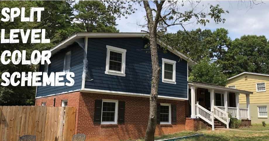
Let’s just go ahead and address it: deciding on an exterior paint color for your split-level home is one of the hardest decisions you’ll make as a homeowner. It’s not just picking a color — it’s committing to it in front of every neighbor, every passerby, and every person who’s ever going to look at your house for the next decade.
It gets even harder when the goal is bringing a split-level into the 21st century — ridding it of 1970s pastels and giving it the modern facelift it deserves. I went through this exact process when I set out to modernize my split-level home, and it took me longer to choose an exterior color than it took to actually paint the house.
In this guide I’ll walk you through 10 exterior color schemes that work specifically on split-level architecture, explain why each one works, and give you a simple system for choosing the right one for your home. If you’re also tackling the interior, check out our companion guide: 8 Interior Color Schemes for Split Level Homes.
1. Modern Blue (Hale Navy – #434C56)
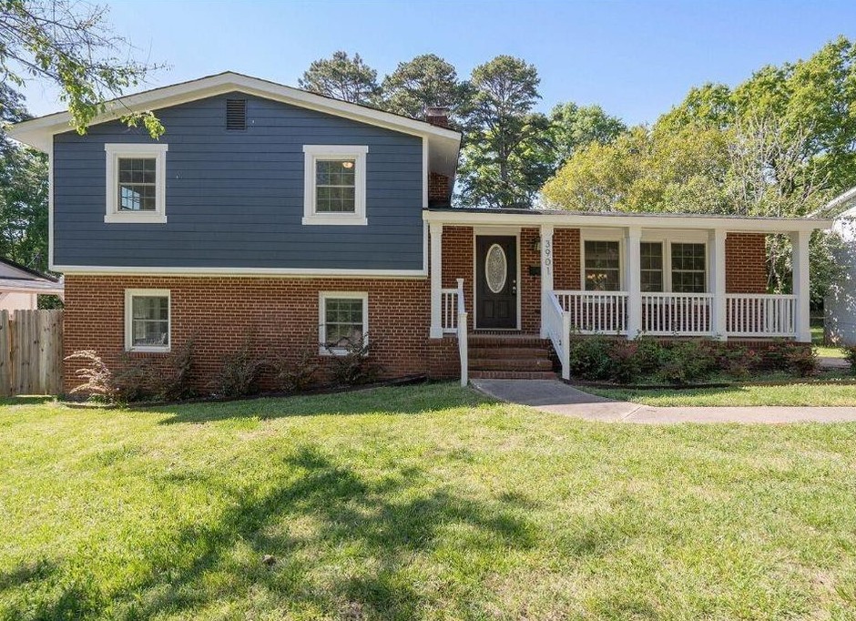
When I updated my own split-level, I wanted a color that would stand out without sticking out. My home has red brick covering most of the facade, and I needed something that would complement rather than fight it. I chose Hale Navy by Sherwin-Williams and haven’t looked back once.
One thing to know about Hale Navy before you commit: painted in a small sample area, it reads almost as gray. It doesn’t reveal its full blue depth until it’s covering a large surface in full sun. Trust the process. The bright white trim I paired with it completes the look perfectly — that high contrast between dark body and bright white trim is the signature of a well-executed modern exterior.
Best trim pairing: Bright white (Sherwin-Williams Extra White or Benjamin Moore Chantilly Lace)
Best accent: Black shutters, black door hardware, natural wood front door
Works with: Red brick, gray stone, dark wood accents
2. Beautiful Beige (Crisp Linen – #F3E6D4)
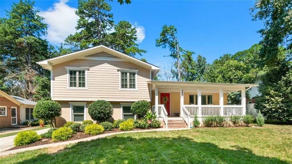
This is the color scheme for homeowners who want a full facelift without going full-modern. The example in our photo is a split-level that achieved a total transformation while keeping things warm, inviting, and HOA-proof. One thing that makes this particular example work so well: the owners installed new fiber cement siding before painting, which gives the paint a cleaner surface to adhere to and significantly extends the life of the finish.
Crisp Linen reads as an elevated off-white with just enough peach warmth to keep it from feeling sterile. It’s the kind of color that looks intentional without being polarizing.
Best trim pairing: Bright white or a slightly deeper cream
Best accent: Tan or medium brown shutters, black or oil-rubbed bronze hardware
Works with: Tan brick, new fiber cement siding, wood shake accents

Giveaways, Ebook, and Forum coming soon. Be the first to know about new content!
3. White on White (Olympic Mountains – #E3DED1)
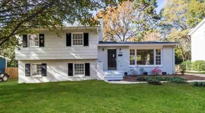
Classic white on white never goes out of style and it never looks dated. It’s the exterior equivalent of a white button-down shirt — clean, timeless, and works in every context. Olympic Mountains is a warm, slightly greige white that avoids the stark, clinical look of a pure bright white while still reading as clean and modern from the street.
The secret to making an all-white exterior look intentional rather than unfinished is contrast — a black or dark front door, black window frames, or dark hardware. Without any contrast, white on white becomes invisible. Add one dark element and suddenly the whole exterior has a point of view.
Best trim pairing: Slightly brighter white or same color as body for a monochromatic look
Best accent: Black door, black window frames, dark bronze hardware
Works with: Any brick tone, any siding material, any architectural era
4. Craftsman Green (Adirondack Green – #89987F)

The craftsman aesthetic is having a long moment, and earthy greens are right at the center of it. Adirondack Green by Behr is a muted, sophisticated olive-gray green that reads as natural and grounded rather than loud. It doesn’t scream “green” — it whispers it, which is exactly what makes it work on a suburban split-level without sticking out.
If I were going this route, I’d lean hard into the craftsman angle: dark walnut-stained porch columns (a great reason to tackle the porch column replacement project if you haven’t already), corbels stained to match, and black window trim. The combination of the muted green body with natural wood accents and dark trim is one of the best looks available for a split-level right now.
Best trim pairing: Creamy white or bright white depending on how much contrast you want
Best accent: Dark walnut stain on wood elements, black window frames
Works with: Brown or tan brick, wood shake shingles, stone accents
5. Brown (Swiss Chocolate – #635644)
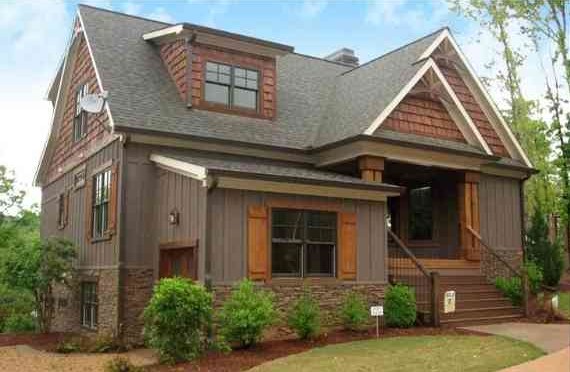
Brown is one of the most underrated exterior colors for split-level homes, and it’s making a quiet comeback. Swiss Chocolate by Sherwin-Williams is a rich, warm brown that sits at the intersection of traditional and contemporary — earthy enough to feel grounded, deep enough to feel modern.
For trim, skip the bright white — the contrast is too stark against a warm brown body. An off-white like Sherwin-Williams Antique White or Benjamin Moore White Dove creates a softer, more cohesive look. Brown pairs beautifully with wood shake shingles, which add texture and depth to what can otherwise be a flat-looking exterior. If your split-level has a section of wood shake on the upper level, a deep brown body is a natural partner.
Best trim pairing: Off-white (Antique White or White Dove) — avoid bright white
Best accent: Copper or oil-rubbed bronze fixtures, natural wood elements
Works with: Wood shake shingles, tan or brown brick, stone foundations
6. French Painted Brick / Whitewash / Limewash
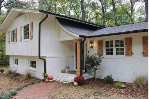
I’ll be upfront: this look requires some restraint on a split-level. French provincial brick and limewash finishes are typically associated with grand estate homes, and dropping that aesthetic into a suburban neighborhood can go either way. Done right though, a limewashed or whitewashed brick split-level is stunning — distinctive, warm, and completely individual.
Most split-levels have a combination of brick and siding, which is actually an advantage here. The whitewashed brick handles the lower level and the siding above can be painted in a complementary color — a warm linen, a soft sage, or even a dark navy for dramatic contrast. Finding the right siding color to pair with whitewashed brick is the critical decision.
Limewash can be applied with latex paint thinned with water or with a dedicated limewash product like Romabio. Both methods produce slightly different results — Romabio gives a more authentic, chalky European finish while the DIY latex method is more controllable for beginners. Make sure your painter has specific limewash experience before hiring out — technique matters significantly with this finish.
Best siding pairing: Warm linen, soft sage, or deep navy above the brick
Best accent: Black or aged iron hardware, natural wood door
Works with: Red, orange, or tan brick
7. Black Exterior (Iron Ore – #444543)
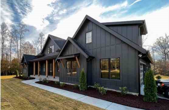
Black is still in. Four years after the black exterior trend exploded and plenty of people predicted it would fade fast, it’s still one of the most requested exterior looks and it’s easy to see why. A black exterior is bold, clean, and makes a small house feel like a regal mansion when executed correctly.
Iron Ore by Sherwin-Williams is the industry go-to for black exteriors — it’s not a true black but a very deep charcoal that reads as black from the street while avoiding the harshness of a pure black in full sun. The key to making black work on a split-level is warm wood accents. A black exterior without any warm element looks severe. Add a natural wood front door, stained wood porch ceiling (if applicable), or wood-toned window boxes and the whole composition breathes.
Best trim pairing: Bright white for maximum contrast, or match the body for a full-black monochromatic look
Best accent: Natural wood door, warm wood tones, brass or gold hardware against the dark body
Works with: Any brick tone, modern siding, fiber cement
8. Soft Yellow
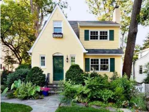
Soft yellow is having a genuine comeback — and honestly, it makes more sense on a split-level than most people expect. Yellow was everywhere in the 1970s and got unfairly associated with the dated look of that era, but the new generation of soft, muted yellows has nothing in common with those old mustard shades. Think warm butter, not school bus.
Soft yellow works especially well on split-levels surrounded by mature trees and established landscaping. The warm yellow body against deep green foliage is a natural, appealing combination. Green shutters and a green front door (as shown in our example) tie the house to the landscape in a way that few other exterior colors can pull off. If you’re in an established neighborhood with large trees, soft yellow is one of the most underrated choices available.
Best trim pairing: Crisp white or a slightly deeper cream
Best accent: Green shutters, green or black front door
Works with: Mature landscaping, brick foundations, wood shake accents
9. Sage Green (Evergreen Fog – SW 9130)
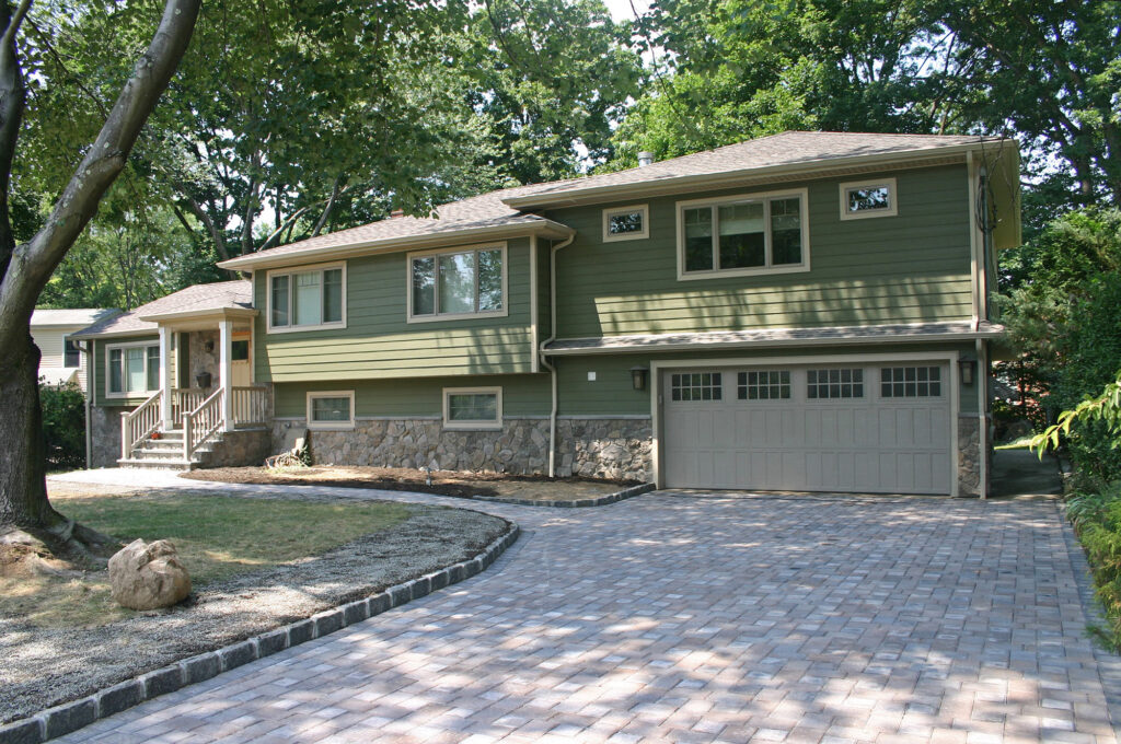
Sherwin-Williams named Evergreen Fog its 2022 Color of the Year for good reason — and three years later it’s still one of the most requested exterior colors in the market. It sits in a perfect sweet spot between green, gray, and sage, reading differently depending on the light and the surrounding landscape. In morning light it leans gray. In afternoon sun it goes unmistakably green. At dusk it almost disappears into the landscape in the best possible way.
For split-levels specifically, Evergreen Fog is particularly effective because it softens the geometric angularity that can make split-levels look blocky. The organic, nature-forward color works with the architecture rather than emphasizing its hard lines. Pair it with warm white trim and natural wood accents for a look that’s distinctly modern without being cold.
Best trim pairing: Alabaster (SW 7008) or Antique White for warmth
Best accent: Natural wood front door, warm bronze hardware, dark window frames
Works with: Any brick tone, fiber cement, wood shake
10. Charcoal Gray (Kendall Charcoal – HC-166)
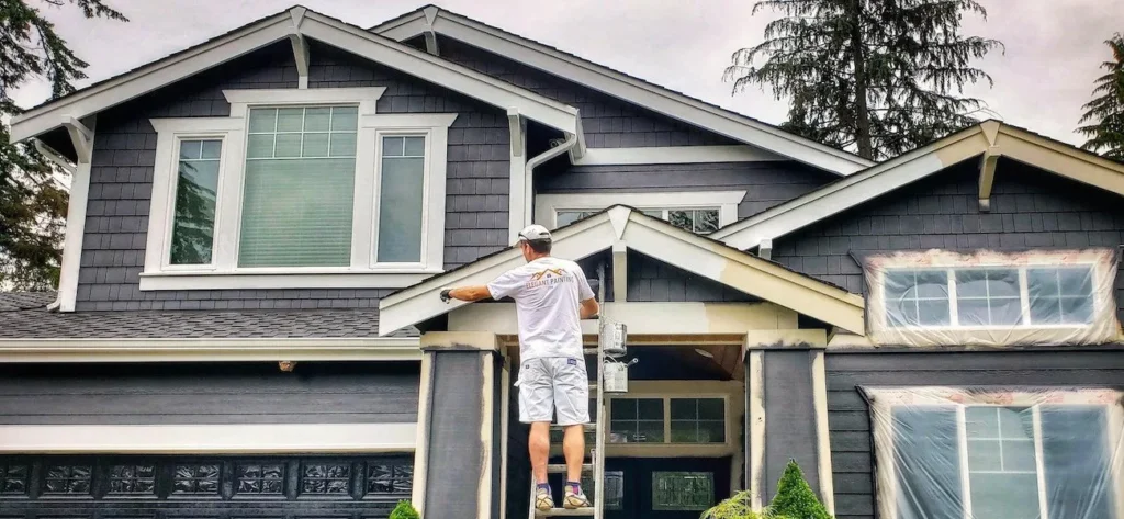
Kendall Charcoal by Benjamin Moore has quietly become one of the most searched exterior paint colors online, and for good reason — it threads the needle between the drama of a black exterior and the subtlety of a gray, landing in a place that feels bold, sophisticated, and completely contemporary.
Unlike Iron Ore which reads as almost-black, Kendall Charcoal reads clearly as a deep, cool gray in full daylight. This distinction matters on a split-level because the lighter value gives the architecture more definition — shadow lines, depth changes, and surface transitions all show up better against a deep gray than they do against a near-black. If you love the idea of a dark exterior but want something with a bit more nuance than black, Kendall Charcoal is the answer.
Best trim pairing: Bright white (Chantilly Lace OC-65) for sharp contrast
Best accent: Warm wood door, black window frames, brushed nickel or chrome hardware
Works with: Gray or white brick, modern siding, fiber cement
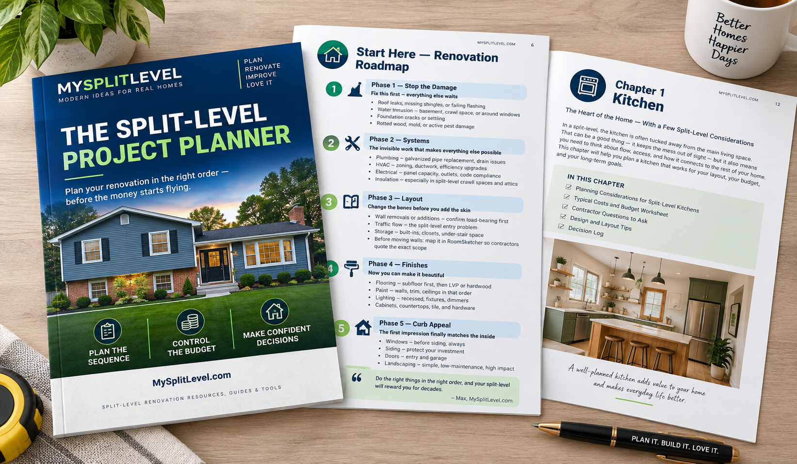
Planning a split-level renovation? I put everything I learned into one system — a room-by-room roadmap, real budget worksheets, and a contractor bid comparison tool. Built from my own renovation, not generic advice.
How to Choose an Exterior Paint Color: A Simple System
Finding the right exterior color scheme is one of the most paralyzing decisions in home renovation because the stakes feel high and the variables feel endless. Here’s the system I used and recommend:
Step 1: Decide Your Intent
Before looking at a single color, answer this question: do you want to stand out or blend in? There’s no wrong answer, but it narrows the field immediately. A homeowner who wants to be the bold, modern house on the street is looking at a completely different palette than one who wants a clean, timeless update that fits the neighborhood.
If you have an HOA, pull your guidelines before getting excited about anything on this list. Most HOAs have an approved color palette — work within it, but know that every color on this list has a HOA-friendly equivalent.
Step 2: Start with What You Can’t Change
Your brick, stone, or masonry isn’t getting painted (usually). Your roof color stays. Your concrete driveway stays. These are your fixed elements and your paint color needs to work with them, not against them. Identify the dominant undertone of your fixed elements — warm (red, orange, tan) or cool (gray, blue, purple) — and choose a paint color with a compatible undertone.
Step 3: Scan Pinterest for Proof of Concept
Once you have a general direction, search Pinterest for that color on actual houses. Search “[color] exterior house paint” or “split level exterior [color].” You’re looking for real homes that have already committed to the color you’re considering — specifically homes with similar brick tones, similar architecture, and similar landscaping to yours. A color that looks incredible on a modern farmhouse with white brick can look completely wrong on a 1970s split with tan brick.
Step 4: Get the Hex Code
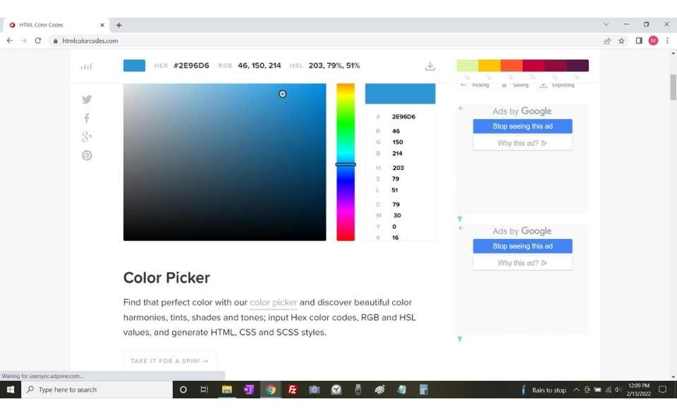
Once you’ve found a color you like, do a Google search for “[color name] hex code.” You’ll get something that looks like #A123B4. Write it down.
Pro tip: Once you have the hex code, you can order that exact color from any paint brand, not just the brand that created it. Sherwin-Williams can match a Benjamin Moore color. Home Depot can match a Sherwin-Williams color. The hex code is universal.
Step 5: Explore the Full Color Palette
Take your hex code to coolors.co and drop it into the palette generator. This pulls up every color palette that includes your color and shows you the complementary trim, accent, and secondary colors that other designers have paired with it. It’s the fastest way to build a complete color scheme rather than just picking a body color and guessing at everything else.
Tip: If you’re completely undecided on a direction, go to the coolors.co palette browser and hit the spacebar to cycle through thousands of palettes at speed. Something will catch your eye.
Step 6: Use a Digital Visualizer Before Buying a Drop
Both major paint brands offer free online tools that let you test colors on your actual house photo before spending a dollar on paint:
- Sherwin-Williams ColorSnap Visualizer — upload your home’s photo and try any SW color on it virtually
- Benjamin Moore Personal Color Viewer — same concept for BM colors
Neither tool is perfect — screen colors differ from real-world paint — but they’re excellent for quickly eliminating colors that obviously won’t work before you commit to a sample.
Step 7: Sample on the Actual House
Never skip the sample step. The paint chip at Lowe’s looks nothing like a full house exterior. The visualizer is close but not exact. The only way to know how a color will look is to paint a 2×2 foot sample on the actual surface in the actual sunlight and look at it at different times of day — morning, afternoon, and evening. Colors shift dramatically between direct sun and open shade.
Paint at least two samples of finalists side by side on the same wall for a direct comparison.
Frequently Asked Questions
Can you use exterior paint inside?
Yes, technically — using leftover exterior paint on an interior project won’t cause any harm. But exterior paint is formulated to resist UV exposure, moisture, and temperature swings, none of which matter indoors. It also tends to have a stronger odor and longer off-gassing period than interior paint. If you’re buying new paint for an interior project, buy interior paint with the same color code — it’s usually cheaper and better suited to the application.
How much paint do I need to paint the exterior of a 1,500 square foot house?
A 1,500 square foot house typically requires 8–10 gallons for two coats, accounting for doors, windows, and other areas that don’t get painted. Buy two 5-gallon buckets rather than individual gallons — the per-gallon cost is significantly lower and you avoid color variation between batches. For the application, a quality paint sprayer dramatically speeds up the job compared to rollers and brushes on a full exterior.
This one is great for exterior projects at a fraction of the cost of the Graco ones from Lowe's and Home Depot. I used this to paint my whole home exterior.

How long does exterior paint take to dry?
Under normal conditions (65–85°F, moderate humidity), exterior paint is dry to the touch within 1–2 hours and ready for a second coat in 4–6 hours. Full cure takes 30 days. In high humidity environments — the Southeast in summer, for example — dry time can stretch to 12–16 hours between coats. Never paint when rain is forecast within 24 hours or when temperatures are below 50°F. Both will compromise adhesion and finish quality.
Should I paint my split-level’s brick or leave it natural?
This depends entirely on the brick. If your brick is in good condition and a warm, attractive tone, leaving it natural and painting only the siding is often the better choice — painted brick requires ongoing maintenance and is very difficult to reverse. If your brick is dated, stained, or a color that fights everything around it, painting or limewashing it can be transformative. A limewash finish (rather than full paint) is the more reversible option that also looks more authentic.
What exterior upgrades should I combine with a repaint?
A fresh exterior paint job highlights everything that isn’t fresh. If you’re repainting, consider doing it in combination with replacing your porch columns and updating your exterior window trim. Both projects can be done in a weekend, cost under $1,000 combined, and the three upgrades together create a curb appeal transformation that’s dramatically more impactful than any one alone.
Final Thoughts
The color you choose for your split-level’s exterior sets the tone for the entire home — both for you every time you pull into the driveway and for everyone who sees it from the street. Take the time to go through the system above, sample on the actual house, and trust your instincts once you’ve done the homework.
If you’ve recently painted your split-level, I’d genuinely love to see it — reach out through the contact page and I’ll consider adding it to this article as a real-world example.
Once the exterior is sorted, the natural next project is the interior. Our guide to split-level interior color schemes covers 8 complete palettes designed specifically for the multi-level visibility challenge that makes choosing interior colors for a split-level uniquely difficult.
Planning a split-level renovation? I put everything I learned into one system — a room-by-room roadmap, real budget worksheets, and a contractor bid comparison tool. Built from my own renovation, not generic advice.

Max
Max Lowrie, founder of MySplitLevel.com® and author of The Live In Flip© bought his first split level house in 2016. During a lengthy renovation, Max noticed that there was little useful content online specific to split-level homes. Max now devotes his time to share his knowledge hoping to help homeowners avoid unnecessary mistakes, and provide a blue print for split-level owners nationwide.
Giveaways, Ebook, and Forum coming soon. Be the first to know about new content!